-01.png)
什么是响应式表格(响应式表格和普通表格的区别)
响应式表格就是表格随着屏幕的变化而自动变化格式方便阅读的表格
随着各种手持设备的出现,要想让你的Web页面适合千罗万像的设备浏览,响应式设计的呼声越来越高。在Bootstrap中也为表格提供了响应式的效果,将其称为响应式表格。
Bootstrap提供了一个容器,并且此容器设置类名“.table-responsive”,此容器就具有响应式效果,然后将<table class="table">置于这个容器当中,这样表格也就具有响应式效果。
Bootstrap中响应式表格效果表现为:当你的浏览器可视区域小于768px时,表格底部会出现水平滚动条。当你的浏览器可视区域大于768px时,表格底部水平滚动条就会消失。示例如下:
<div class="table-responsive">
<table class="table table-bordered">
   …
</table>
</div>
运行效果如下:
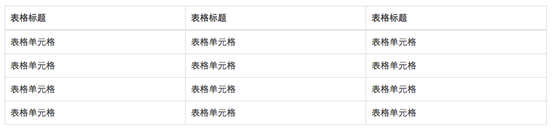
(宽屏效果)
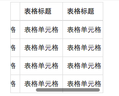
(窄屏效果)
将任何 .table 元素包裹在 .table-responsive 元素内,即可创建响应式表格,其会在小屏幕设备上(小于768px)水平滚动。当屏幕大于 768px 宽度时,水平滚动条消失。
垂直方向的内容截断
响应式表格使用了 overflow-y: hidden 属性,这样就能将超出表格底部和顶部的内容截断。特别是,也可以截断下拉菜单和其他第三方组件。
Firefox 和 fieldset 元素
Firefox 浏览器对 fieldset 元素设置了一些影响 width 属性的样式,导致响应式表格出现问题。可以使用下面提供的针对 Firefox 的 hack 代码解决,但是以下代码并未集成在 Bootstrap 中:
Copy
@-moz-document url-prefix() {
  fieldset { display: table-cell; }
}
更多信息请参考 this Stack Overflow answer.
| # | Table heading | Table heading | Table heading | Table heading | Table heading | Table heading |
|---|---|---|---|---|---|---|
| 1 | Table cell | Table cell | Table cell | Table cell | Table cell | Table cell |
| 2 | Table cell | Table cell | Table cell | Table cell | Table cell | Table cell |
| 3 | Table cell | Table cell | Table cell | Table cell | Table cell | Table cell |
<div class="table-responsive">
  <table class="table">
    ...
  </table>
</div>
【转载】博客园-范仁义
© 版权声明
文章版权归作者所有,未经允许请勿转载。
相关文章
暂无评论...
飞鱼个人资源站点